Last updated: 29 September 2015
Public spending on education has risen over time and over the past 40 years has consistently been around 4–6% of national income. However, the composition of education spending changes over time. Recently, the proportion going to schools has increased, with schools having been protected from the government's recent spending cuts, while the proportion going to universities has fallen, as reforms have shifted the balance of paying for higher education away from the government and towards students.
Education spending now represents around an eighth of overall spending. The share of spending devoted to education has risen over time; it almost doubled between 1953–54 and 1973–74, from 6.9% to 12.5% of total spending. It then remained fairly stable, dipping in the early to mid 1980s, before rising to around 13% throughout the 2000s. Figures 1a and 1b show the alternating periods of flat and rising real education spending over the second half of the twentieth century, as well as education spending rising as a share of national income over time.
Figure 1a. Education spending in real terms (£ billion, 2015–16 prices), 1953–54 to 2014–15
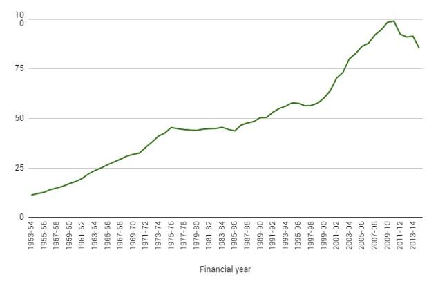
Source: Table 4.2 of HM Treasury, Public Expenditure Statistical Analyses (PESA) 2015. Previous editions of PESA. Office for National Statistics, United Kingdom National Accounts, The Blue Book 1997.
Over the whole period up to 2010–11, the average annual rate of real growth in education spending was a little under 4%. But more recently, in a climate of overall public spending cuts, real-terms spending on education has fallen. The coalition government froze non-investment spending on schools and implemented substantial real-terms cuts to other, unprotected, parts of the Department for Education's budget. This briefing note explores schools spending under the coalition government in greater depth.
Spending on education is driven by a combination of demographics and demand. Spending on primary and secondary education, for example, is a function of the number of school-age children. By contrast, spending on higher education depends not only on the student-age population but also on how large a proportion of that population chooses to go to college or university and on what fraction of this service is publicly funded. Figure 2 shows the number of pupils in state primary and secondary schools between 1947 and 2014, with projections up to 2019.
Figure 2. Pupils in state primary and secondary schools (million), 1947 to 2019
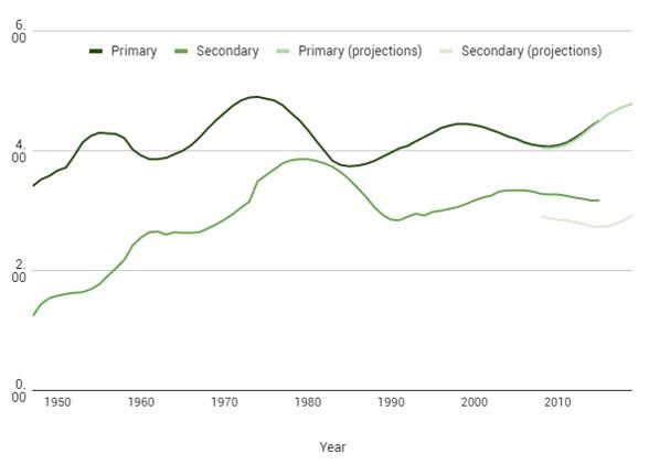
Note: The minimum school-leaving age was increased from 14 to 15 in April 1947 and from 15 to 16 in September 1972. Figures shown up to 2013 are total pupils. Projections are for full-time equivalents in state-funded schools; projections for secondary school pupils include only those aged 15 and under.
Source: Historical series from Department for Education and Skills, Statistics of Education: Class Sizes and Pupil Teacher Ratios in England, February 2003. Figures from 2003 are from Department for Education, Statistics: school and pupil numbers, Schools, pupils and their characteristics: January 2015; and Department for Education, Statistics: pupil projections, National pupil projections: trends in pupil numbers – July 2015.
The rise in the school-age population from the 1950s until the mid 1970s accompanied increases in education spending. Public spending on education then began to stagnate in the 1970s, at the same time as the number of school children began to decline. In the 1990s, when the number of pupils picked up, spending did not rise to match the increase. The number of pupils in England rose from 6.8 million in 1990–91 to 7.5 million in 1998–99, but spending on education as a proportion of national income fell by 0.2 percentage points over the same period.1
The Labour government from 1997 reprioritised education and increased education spending much more quickly, despite a slight decline in the number of pupils. So spending per pupil rose and may, in some sense, have been ‘catching up’ with the increase in the number of pupils seen in the 1990s.
Spending on schools has been one of the areas that have been relatively protected from cuts over recent years. As with health spending, this protection has come in the form of a real-terms freeze rather than a continuation of the relatively large annual increases seen in the 2000s. However, although overall schools spending has been protected, the allocation of spending between schools has not been constant. In 2010, the government announced a nominal freeze of per-pupil funding, combined with a new ‘pupil premium’ targeted at disadvantaged pupils, as well as a reform to the school funding formula, which would simplify the method of allocating funds between schools (see this briefing note for more information).
Education spending by sub-function
Figure 3 shows a breakdown by function of education spending in 2014–15, giving a picture of how much the government spends on each level of education. The figure shows that spending on primary and secondary schools (including further education) accounts for the bulk of total education spending (74.6% in 2014–15). The next-largest spending item is higher education, which in 2014–15 accounted for 12.2% of education spending, while spending on the under-5s accounted for 6.1%.
Figure 3. Education spending by sub-function, 2014–15
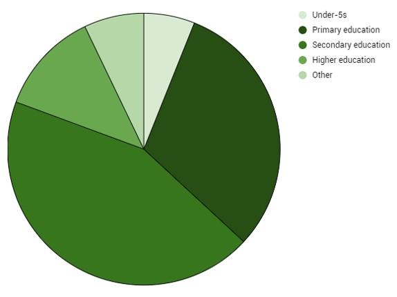
Note: ‘Other’ category includes subsidiary services to education, research and development in education, and education not definable by level (equivalent to training).
Source: HM Treasury, Public Expenditure Statistical Analyses (PESA) 2015.
Under the Labour government, over the 2000s, spending on schools, early years education and further education all grew relatively quickly, while higher education spending grew relatively slowly. Recent cuts appear to have maintained those priorities; schools spending has been protected while higher education spending has been cut in real terms. However, these cuts to public funding of higher education were offset by a significant reform in 2012–13, which increased the level of tuition fees that universities could charge students (from £3,375 per year for 2011–12 entrants to £9,000 per year for 2012–13 entrants). Since 2011–12, total higher education funding has actually increased in real terms, but the balance of funding universities has shifted away from central government grants (which were cut substantially) and towards students (for more information on the changes in spending on higher education, see this report).
International comparisons of education spending
Table 1 shows how the UK’s education spending in 2010 compared with that of four other major economies. These figures include both public and private education spending, apart from Italy, which only includes public education spending for primary and secondary levels. At 6.5%, the UK spent a higher share of national income on education than Italy, Japan and France, and a lower share than the US at 7.3%.
Table 1. Spending on education in selected major economies, 2010

Note: Indices for spending per student are taken from figures that were converted into US dollars using purchasing power parities. Italy’s figures on primary and secondary education include only spending on public institutions.
Source: OECD, Education at a Glance 2013: OECD Indicators.
The second to fourth columns show spending per student at primary, secondary and tertiary levels, relative to the UK (indexed to 100).2 They show that, as well as spending a higher proportion of its national income on education, the US spends more per pupil at all stages of education than any other country shown. Relative to the UK, the US spends 20% more per pupil at primary and secondary school level, and just over 60% more on tertiary education per head.
Relative spending per head may be driven both by the size of the economy (a country with higher income per capita can afford to spend more per pupil) and by the relative prioritisation of education. For example, as the US is the richest of the countries shown, it is reasonable for it to spend the most per head. In order to adjust for relative income and show an indicator of public spending priorities, the final three columns of Table 1 show spending per head per unit of average income, or spending per pupil taking into account different income levels.
In terms of spending per head, for primary, secondary and tertiary education, the UK lies somewhere in the middle of the other four countries shown. However, after controlling for the level of income, the UK actually spends more per head on primary and secondary education than any of the other countries (apart from French spending on secondary education).
Making the adjustment for national average income levels does not have much effect on the ranking of tertiary education spending per head – the US spends so much more on this that, even after adjusting for its higher income, it still spends 22% more than the UK per student.
Useful resources
- 2015 election briefing note on schools spending under the coalition
- 2015 observation comparing the main parties' education spending pledges
- 2014 report on the financial support available to higher education students
- 2013 report on the outlook for higher education spending
- 2011 briefing note on trends in education and schools spending